Table of Contents
- What is NannyML?
- Why use NannyML?
- Presenting the US Census Employment dataset
- Understanding the ASCEmployment dataset
- Presenting the employment prediction model
- Defining partitions and preprocessing
- Building the model
- Monitoring the employment prediction model with NannyML
- Estimating performance without targets
- CBPE in practice
- How CBPE works
- Limitations and assumptions of CBPE
- Investigating data distribution shifts
- Assessing the accuracy of NannyML’s estimations
- Conclusions
- Recommended Reads
.jpg)
Do not index
Canonical URL
A quickstart is supposed to give you a quick start to a library’s most important features. We recently revamped ours to highlight the value of NannyML’s most essential features: performance estimation and data drift detection.
In this blog post, we want to provide extra context on our newest quickstart. We will review the dataset and ML model in detail as well as expand on how NannyML’s methods work.
Let’s start by understanding what NannyML is and why it is useful to have it in your ML monitoring system.
What is NannyML?
NannyML is an open-source Python library that allows you to estimate post-deployment model performance, detect data drift, and intelligently link data drift alerts back to changes in the model performance. NannyML has an easy-to-use code interface and interactive visualizations. It is completely model-agnostic and currently supports all tabular use cases, classification, and regression.
The core contributors of NannyML have researched and developed multiple novel algorithms for estimating model performance: confidence-based performance estimation (CBPE) and direct loss estimation (DLE). The team also invented a new approach to detect multivariate data drift using a PCA-based method for data reconstruction.
Why use NannyML?
One of the main challenges in ML monitoring is knowing how your ML models are performing after being deployed. By using NannyML, data scientists can maintain complete visibility and trust in their deployed ML models. Since it allows them to:
- Monitor the business value of the ML model: Business Value Metric
- Analyze data drift over time: Univariate Drift, Multivariate Drift
- Discover the root cause of model performance issues: Univariate Drift
To understand how we can take advantage of these features, we will build a monitoring flow with NannyML on a real-world dataset. The dataset was taken from the US Census office and presents the task of predicting whether an individual is employed or not based on demographic characteristics.
Presenting the US Census Employment dataset
The US Census Bureau is mostly known for the decennial census, where every ten years, they count each resident of the US and record where they live. But apart from that, they also offer several high-quality data products, many based on annual surveying efforts.
The US Census Employment dataset was derived from one of these surveys, specifically the American Community Survey (ACS), which is the premier source for detailed population and housing information about the US.
In 2022, in an effort to find new datasets for fair machine learning, a group of researchers from UC Berkeley and the Toyota Research Institute put together a Python package called Folktables where they provide access to datasets derived from the US Census, and facilitated the benchmarking of machine learning algorithms. The package also includes a suite of pre-defined prediction tasks in domains including income, employment, health, transportation, and housing. In the quickstart and in this blog post, we focus on the employment dataset.
The datasets in the package are also ideal for studying the effect of distribution shifts in ML models, as each prediction task can be instantiated on datasets spanning multiple years. For example, we can train a classifier using data from 2014 and evaluate how its accuracy varies over time, which fits perfectly for our intended use case.
The employment dataset, also referred to as ASCEmployment in the Folkstable package, has 346,221 rows, each containing the survey answers from different individuals from the years 2014 to 2018. For each person, we have demographic characteristics such as age, marital status, educational level, nativity, etc, as well as employment status.
Check out the ASCEmployment column dictionary to learn more about all the 17 features in the dataset.
Understanding the ASCEmployment dataset
To understand the data better, it's essential to consider its scope and limitations. As mentioned in the Folktables paper, the census data used in this analysis is focused on the United States and should be viewed as a reference dataset rather than an in-depth study on employment. Therefore, the results of our exploratory analysis do not reflect the experiences of most individuals or provide an accurate picture of the current employment situation in the US.
Having that in mind, we start by exploring the age distribution of the surveyed people and their employment status (target variable). The median age of the surveyed population is 42 years. 77% of the employed population belong to the 16 to 56 age range. If someone belongs in this range, it is likely that the person is employed.

Second, we plot the correlation between the features and the target variable. Since most of the variables are nominal (categorical variables with no intrinsic order), we can’t compute the usual Pearson correlation coefficient. Instead, we calculated Cramer's V, which is a measure of association between two nominal variables.
.svg)
The above heatmap suggests that the two most correlated features with the target variable are
- SCHL: educational attainment
- MIL: military service
When we plot the education level segmented by employment status, we observed that the majority of the consulted population has a high school diploma or above. If an individual has a bachelor's degree or above is very likely to be employed. This explains why the education level column has a high correlation with the target variable.
.svg)
The second feature with a high Cramer V coefficient is MIL which stands for Military status. From the plot below, we observed that the survey responses are biased toward people that have never served in the military.
If a model trained on this data is used on people that served in the military implies a drift to the MIL feature as well as a potential performance drop because of the model being used on unknown regions.
.svg)
Now that we understand the type of data we'll be using, we can create a machine learning model to predict whether an individual is employed or not. This prediction will be based on the demographic features we have examined.
Presenting the employment prediction model
In the quickstart, we presented the ASCEmployment dataset alongside the predicted labels and predicted probabilities made from an ML model. In this section, we plan to show the behind-the-scenes of that ML model and how well it generalizes on train and test data.
Defining partitions and preprocessing
We split the data into three partitions simulating the model lifecycle: train, test, and production (after deployment) data. We will use 2014 data for training, 2015 for evaluation, and 2016-2018 will simulate production data.
df['partition'] = None
df['partition'] = np.where(df['year']==2014, 'train', df['partition'])
df['partition'] = np.where(df['year']==2015, 'test', df['partition'])
df['partition'] = np.where(df['year']>2015, 'prod', df['partition'])
We now define categorical and numerical features
categorical_features = ['SCHL', 'MAR', 'RELP', 'DIS', 'ESP',
                        'CIT', 'MIG', 'MIL', 'ANC', 'NATIVITY',
                        'DEAR','DEYE', 'DREM', 'SEX', 'RAC1P']

numeric_features = ['AGEP']
In the model building section, we will use an LGBM model, and since categorical features are already encoded correctly for the LGBM model (non-negative, integers-like), we don’t need much preprocessing.
Building the model
We now fit the model that we will be monitoring. As mentioned before, we will use an LGBM model, with its default parameters.
X_train = df[df['partition']=='train'][features]
y_train = df[df['partition']=='train'][target_col]

X_test = df[df['partition']=='test'][features]
y_test = df[df['partition']=='test'][target_col]

# Instantiating and fitting the model
model = LGBMClassifier()
model.fit(X_train, y_train, categorical_feature=categorical_features)
Now that we have a model that generalizes well on both the train and test sets, we can start thinking about how to monitor it to make sure that it still generalizes on unseen production data.
Monitoring the employment prediction model with NannyML
To monitor a model, NannyML needs two things, a reference and an analysis set.
- Reference data: NannyML uses the reference set to establish a baseline for model performance and drift detection. The model’s test set can serve as the reference data.
- Analysis data: The analysis data is the data from the period you want to analyze i.e. check whether the model maintains its performance or if the feature distributions have shifted etc. This would usually be the latest production data.
You can think of the reference data as the data that NannyML uses to calibrate all its estimators and the analysis one as the one where we want to check how the model is behaving.
Estimating performance without targets
Monitoring performance is relatively straightforward when targets are available, we can do so by just comparing the model outputs with the actual values, but when dealing with production data, targets can be delayed, costly, or impossible to get.
In such cases, estimating performance is a good start for the monitoring workflow. NannyML can estimate the performance of an ML model without having access to targets.
Currently, NannyML offers two methods for estimating performance, CBPE (Confidence-based Performance Estimation) designed for classification problems and DLE (Direct Loss Estimator) made to estimate the performance of regression models.
In this blog post, we are working with a classification problem, so, we’ll use CBPE to estimate the performance of the model that we created in the previous section.
Monitoring is a priority but your team doesn’t have the resources? we can help you get started. Talk to one of the founders who understand your use case
CBPE in practice
NannyML shares a similar interface to scikit-learn, where you instantiate an estimator, fit it on some data and then use it to estimate new values on other data. Following that logic, with a couple of lines, we have a fitted CBPE ready to estimate the performance on unseen data.
import nannyml as nml

# instantiate CBPE
estimator = nml.CBPE(
    problem_type='classification_binary',
    y_pred_proba='predicted_probability',
    y_pred='prediction',
    y_true='employed',
    metrics=['roc_auc'],
    chunk_size=5000)

# fit CBPE on the reference data
estimator = estimator.fit(df_reference)

# estimate the model performance on the analysis data
estimated_performance = estimator.estimate(df_analysis)

# visualize results
figure = estimated_performance.plot()
figure.show()
When we apply CBPE to our model and the production partition of the ASCEmployment dataset, we observe that the estimated performance dropped significantly for two of the chunks in the analysis period.
.svg)
Chunks are simply samples of data. They are needed to get statistically significant results and reliably assess the performance of an ML model. In our example, we are using a chunk size of 5000, meaning that each point in the above plot is the aggregated result of the estimated performance of 5000 observations.
How CBPE works
In general, when a machine learning classifier returns a prediction, it also provides a numerical value between 0 and 1. This number is often called model score or confidence, and it is a way for the model to express its certainty about what class the input data belongs to.
Depending on the type of model, these scores can’t always be interpreted as probabilities. But by using calibration, we can transform them into real probabilities and use them to estimate the probability of making an error.
For instance, imagine a high-performing model which, for a large set of observations, returns a prediction of 1 (positive class) with a probability of 0.9. It means that the model is correct for approximately 90% of these observations, while for the other 10%, the model is wrong.
CBPE leverages the calibrated confidence scores of the predictions to estimate all the confusion matrix elements (TP, TN, FP, FN) and, with them, estimate any classification performance metric. To learn more about CBPE, and its implementation details, check out our deep dive on CBPE.
Limitations and assumptions of CBPE
In general, CBPE works well when estimating the performance of good models i.e. models for which most of the error is an irreducible error. Such models tend to return well-calibrated probabilities (or scores that can be easily calibrated) and are less prone to concept drift which CBPE does not cope with. The detailed assumptions are:
1. The monitored model returns well-calibrated or easy-to-calibrate probabilities.
Well-calibrated probabilities allow us to accurately estimate confusion matrix elements and thus estimate any metric based on them. Usually, good models (e.g. ROC AUC > 0.9) return well-calibrated probabilities or scores that can be accurately calibrated in post-processing.
2. There is no covariate shift in previously unseen regions of the input space.
CBPE estimations will most likely be less accurate if the drift happens in unseen subregions of the input space. In such cases, the monitored model failed to adequately learn the relationship between the output (Y) and the input (X) due to X not sufficiently representing the distribution observed during production.
3. There is no concept drift.
While CBPE deals well with data drift, it will not work under concept drift i.e. when P(Y|X) changes. Except for very specific cases, there is no way to identify concept drift without ground truth data.
4. The chunk size is large enough.
For accurate and reliable results, it is important to use a sufficiently large chunk size. As the chunk size decreases, the estimations provided by CBPE become less precise. Moreover, when the chunk size is small, it not only affects the performance of CBPE but also makes the calculated metric (when targets are available) unreliable.
To illustrate this, let's consider evaluating a random model with a true accuracy of 0.5 on a sample of 100 observations. In some cases, we may obtain an accuracy as high as 0.65 for certain samples.
For more detailed information on the impact of chunk size and the reliability of results, you can refer to our Reliability of Results Guide.
Investigating data distribution shifts
Returning to our example, when running CBPE, we observed a dropped in the estimated performance. But we are not sure what caused it. To figure out the underlying issue, we can leverage univariate drift detection methods to search for plausible explanations.
Since we have a lot of features that could have drifted (17 in total), one way to prioritize which ones to analyze first is by using NannyML’s
AlertCountRanker method.This method checks the univariate drift results, counts the alerts from each of the features during the analysis period, and returns a sorted dataframe where the first row represents the feature with more alerts. Let’s see how to implement it.
# instantiate an UnivariateDriftCalculator
univariate_calculator = nml.UnivariateDriftCalculator(
    column_names=features,
    chunk_size=chunk_size
)

# fit drift calculator on the reference data
univariate_calculator.fit(df_reference)

# calculate on the analysis data
univariate_drift = univariate_calculator.calculate(df_analysis)


# instantiate an AlertCountRanker
alert_count_ranker = nml.AlertCountRanker()

# rank univariate drift results
alert_count_ranked_features = alert_count_ranker.rank(univariate_drift)

# display results
alert_count_ranked_features.head()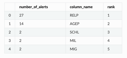
The RELP feature, which encodes the relationship of the person with the house owner, the AGEP, which refers to the aged of the surveyed person, and the SCHL, which refers to the scholarly level of the surveyed person, were the top 3 features that drifted the most, with a total of 41 alerts together. To figure out if they were responsible for the drop in estimated performance, we can check when did the alerts happen and see if they correlate with the performance drop.
When plotting the univariate drift results of RELP, AGEP, and SCHL, we see the following.
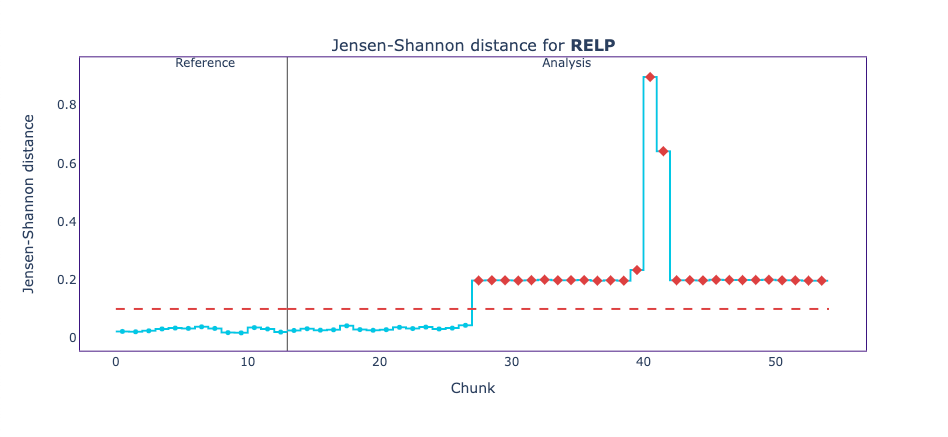
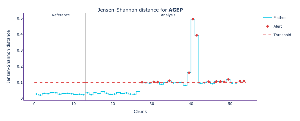
These plots show the Jensen-Shannon distance between the reference data and each chunk of the analysis period. The Jensen-Shannon distance is a way of measuring the similarity between two probability distributions. For the reference period and beginning of the analysis period, we can see how the Jensen-Shannon distance stays below the 0.1 threshold, meaning the two probability distributions haven’t changed much. But, just before the chunk 30, things start to change, and now the probability distribution for some chunks of the analysis period does not resemble the original probability distribution of the reference data.
On both, we see a high peak that likely corresponds to a performance drop. To confirm that this is the case, we can plot these results on top of the performance estimation plot.
.svg)
The main drift peak indeed coincides with the performance drop. It is interesting to see that there is a noticeable shift magnitude increase right before the estimated drop happens. That looks like an early sign of incoming issues.
Now that we figured out which features were responsible for the estimated performance drop. Let’s see if we found out what exactly changed in those features that caused the sudden drop.
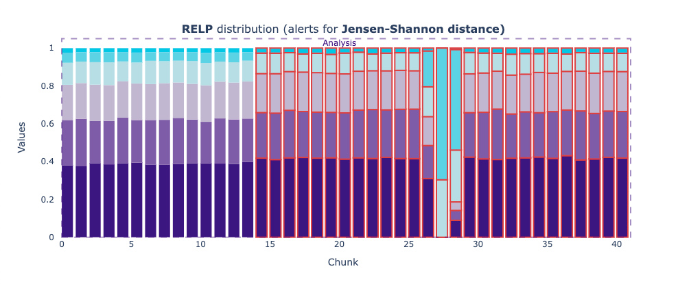
The relative frequencies of the categories in RELP have changed significantly. Since the plots are interactive (when run in a notebook), they allow checking the corresponding values in the bar plots. The category that has increased its relative frequency from around 5% in the reference period to almost 70% in the chunk with the strongest drift is encoded with value 17, which refers to the Non-institutionalized group quarters population.
This corresponds to people who live in group quarters other than institutions. Examples are college dormitories, rooming houses, religious group houses, communes, or halfway houses.
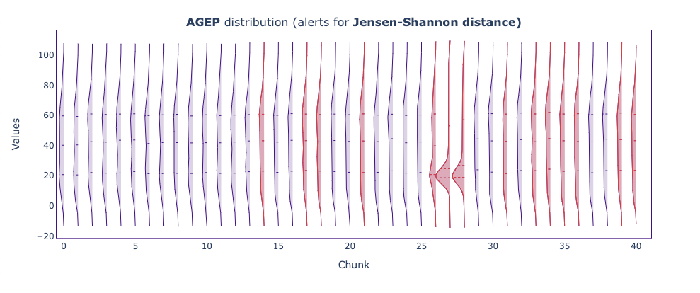
The distribution of person age (AGEP) has strongly shifted towards younger people (around 18 years old).
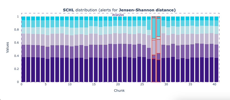
The distribution of SCHL changed, with one of the categories doubling its relative frequency. This category is encoded with value 19, which corresponds to people with one or more years of college credit and no degree.
So the main responders in the period with data shift are young people who finished at least one year of college but did not graduate and don’t live at their parents’ houses. It means that, most likely, there was a significant survey action conducted at dormitories of colleges/universities.
These findings indicate that a significant part of the shift has a nature of covariate shift, which CBPE handles well.
Assessing the accuracy of NannyML’s estimations
Since the survey data in the ASCEmployment dataset was collected from 2014 to 2018, we know the actual labels of the analysis set. So, as an exercise to assess the accuracy of NannyML’s estimation, we can plot the estimated performance vs the realized performance.

We see that the realized performance has indeed sharply dropped in the two indicated chunks. The performance was relatively stable in all the other chunks, even though RELP, AGEP slightly shifted before and after the biggest drop in performance. Confirming the need to monitor estimated performance, as not every shift impacts the performance of ML models.
Conclusions
This blog post presented a deeper analysis of NannyML’s quickstart. We focused on explaining the dataset, the ML model and on elaborating more on how some of the core functionalities of NannyML work.
We showed how performance estimation can be used and how it can help when ground truth is not available. We also showed how to realize which feature drifts are probably causing the performance issues and learned that not necessarily every shift impacts the model performance.
If you consider ML Monitoring a priority but do not have time to implement it we can help you get started. Talk to one of the founders who understand your use case
Recommended Reads
Continue exploring other nannyML features: Tutorial using nannyML and Google Colab
Understand Data Drift our perspective: Focusing on the Impact on Model Performance
If you want to continue exploring all the other NannyML features that we didn’t mention here, check out our Tutorial: Monitoring an ML Model with NannyML and Google Colab.
Written by
