

If you search for information on ML monitoring online, there is a good chance that you'll come across various monitoring approaches advocating for putting data drift at the center of monitoring solutions.
While data drift detection is indeed a key component of a healthy monitoring workflow, we found that it is not the most important one. Data drift and its other siblings’, target, and prediction drift can misrepresent the state of an ML model in production.
The purpose of this blog post is to demonstrate that not all data drift impacts model performance. Making drift methods hard to trust since they tend to produce a large number of false alarms. To illustrate this point, we will train an ML model using a real-world dataset, monitor the distribution of the model's features in production, and report any data drift that might occur.
After, we will present a new algorithm invented by NannyML that will significantly reduce these false alarms.
So, without further ado, let’s check the dataset used in this post.
Power consumption dataset
We use the Power Consumption of Tetouan City dataset, a real and open-source dataset. This data was collected by the Supervisory Control and Data Acquisition System (SCADA) of Amendis, a public service operator in charge of distributing drinking water and electricity in Morocco [1].
It has 52417 records, each of them collected every 10 min for the period of January to December 2017. Each record contains information about the time, temperature, humidity, wind speed, diffuse flows (term to describe low-temperature (< 0.2° to ~ 100°C) fluids that slowly discharge through sulfide mounds, fractured lava flows, and assemblages of bacterial mats and macrofauna [2]), and the actual power consumption of three zones in Morocco.
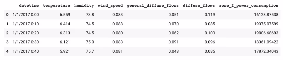
We will predict the values of zone_2_power_consumption by training an ML model on the time, temperature, humidity, etc features.
Before starting an Exploratory Data Analysis (EDA) to understand the features and response variable, let’s split the data into train, test, and production.
Splitting the data
We are used to splitting data into train, validation, and test sets. But, since in this exercise, we want to build a model and see how it behaves in a “production” environment, we will take the last partition and use it as the production data. This will help us simulate the idea of making predictions with a trained model on new unseen data in production.
The following splitting is applied:
- df_train: from January 1st to October 14th of 2017, (39169 data points)
- df_test: from October 15th to November 30th of 2017, (8785 data points)
- df_prod: from December 1st to December 31st of 2017, (4463 data points)
We will train the model with the first ten months of data, then test that it generalizes well by checking its predictions from October and November and finally putting it in “production” on the 1st of December.
Now that our data is split into three parts, let’s check the df_train dataframe and explore its features.
Quick EDA
To get a deeper understanding of the dataset let’s explore the target variable (zone_2_power_consumption), its train distribution, its behavior over time, and its relationship with the features.
The plot below shows that the power consumption distribution looks similar to a bimodal normal distribution, with one pick at around 13 kW and a more pronounced one at 20 kW.
It is interesting to notice the difference in power consumption patterns between week and weekend days. On average less energy is consumed over the weekends. This could be explained by offices, fabrics, and other installations being closed on weekends. This suggests that the is_weekend column might be a good feature when predicting power consumption.
%20(1).svg)
When checking if we can find any daily or hourly pattern, we find that less energy is consumed between 1 am and 8 am, which makes sense since most people sleep between those hours. On the other hand, between 6 pm to 10 pm is when we see the highest energy consumption spikes. This tells us that hour might be a relevant feature to include in the model.
%20(1).svg)
When looking at the daily trend of power consumption, we notice that during the first days of the month, the power consumption seems to be lower, but other than that, the rest of the days behave quite similar.
The monthly trend reveals an increase in power consumption from May to August which makes sense since, according to annual weather averages, those are the warmest months in Morocco [3]. This suggests that month is potentially a good feature for our model.
Finally, we selected the model features by choosing the ones that correlated the most with the target variable.
%20(1).svg)
Main things to notice about this correlation plot.
- It confirms that hour strongly correlates with the target variable zone_2_power_consumption.
- We observe a positive correlation between temperate and the target variable. This tells us that energy consumption moves in the direction of temperature. As temperature increases, an increase in energy use is expected. This might be partly explained by using cooling systems during summer.
Building an ML model
We fit a LightGBM Regressor with the previously selected features: hour, temperature, humidity, general_diffuse_flows, and month.
We pick MAE as the main performance metric. MAE keeps the error on the same scale as the target variable. This makes it easier to interpret.
We obtained a MAE of 3335 kW on the test set. This is an improvement compared to the baseline MAE of 4632 kW obtained by making a constant prediction using the mean.
To put these results in perspective, recall that the train distribution of the target variable has a mean of 20473 kW and a standard deviation of 4980 kW. For more information on this, take a look at the notebook where these experiments were performed.
Below we plot the actual and predicted values for a subset of both the train and test sets. We see how the model is able to generalize well enough and captures the general trend.
%20(1)%201.avif)
Is the model performing well in production?
Now that we have a model, let’s imagine we put it into production and use it to make predictions on unseen data. In this case, how do we make sure that the model is operating in the same conditions it was trained and tested on?
ML models are typically trained on historical data, but they are deployed in real-world scenarios where the data distribution may change over time. New patterns, trends, or anomalies in the data can affect the model's performance, and detecting these changes requires continuous monitoring.
To tackle this issue, a common approach is to use a technique called monitoring data drift, which involves observing changes in the distribution of the model's features.
Monitoring data drift
Data drift monitoring assumes that significant changes in the distribution of the model's features impact the model's performance. However, in practice, this is often not the case.
For example, drift in low-importance features might not impact the model’s performance at all since the features have a low impact on the model’s output. This can result in an excessive number of false positives, creating unnecessary alerts and potentially diverting resources and attention away from more critical issues.
Below, we plot the feature importance to understand which are the most relevant features of our model so we can know which data drift alerts to pay the most attention to.
%20(1).svg)
It looks like temperature and humidity are the most influential features. So let’s investigate if there these features drift during the production period.
By using the NannyML library, we can check for data drift by instantiating an UnivariateDriftCalculator and fitting it on the test set to later compare the test distributions of our features with their production distributions.
Since ML models tend to overfit on their training data. We have found that it is a better approach to fit drift methods on the test set. In order to establish realistic expectations of the feature distributions.
By doing so and plotting the results for the two most important features, we get the following results.
%20(2).svg)
The univariate drift method alerted us that the temperature feature drifted during the production period. Why is that? The mean temperature for the production period was significantly lower than the one for the months of October and the beginning of November. This is expected since December is one of the coldest months in Morocco [3].
%20(1).svg)
We get a similar effect from the humidity feature. The univariate drift method alerts us that the humidity distributions during the production period are significantly different.
After seeing these results, we would expect a sudden drop in the model’s performance since temperature and humidity were the two most important features. But, was that the case?
Plotting the realized performance
Since this is an experiment where we are mimicking a production environment and the data is from 2017, we have access to the actual target values of the production period. So we can plot the realized performance and check if the alerts given by data drift really meant that the model performance degraded.
When plotting the realized performance for the reference and production period, we don’t see any alerts!
%20(1).svg)
In the context of model performance, this shows that all the data drift alerts were false alarms! The performance remains between the acceptable thresholds, so our model is still working as expected.
Limitations of univariate data drift
- Lack of context: univariate data drift monitoring does not take into account the relationship between the variable being monitored and other variables in the system. As a result, changes in the variable being monitored may not necessarily indicate a problem in the system as a whole.
- Limited to one variable: univariate data drift monitoring only considers changes in a single variable, which may not be sufficient for detecting complex changes in the system as a whole. For example, changes in the relationship between multiple variables may be missed.
- Sensitivity to outliers: univariate data drift monitoring may be sensitive to outliers or extreme values in the data, which can lead to false alarms or missed detections.
To learn more about the limitations of univariate data drift and how to overcome them, check out NannyML’s Multivariate Data Drift Method.
Having drift detection at the center of an ML monitoring system can sometimes do more harm than good. Since it may overwhelm the team with too many false alarms, causing alert fatigue.
Having too many false alarms can make it difficult for us to identify and respond to the important ones, as the excessive noise they generate can be overwhelming and distracting.
.svg)
The good news is that there is a better way to monitor ML models without being fooled by data drift. And it is by leveraging probabilistic methods to estimate the model’s performance!
How not to get fooled: Monitoring estimated performance
In this section, we use NannyML again, but this time to estimate the model’s performance—the nannyml.DLE class offers a way to estimate the performance of an ML model in production without having access to the targets.
How DLE works
DLE, which stands for Direct Loss Estimation, is a method to estimate performance metrics for regression models.
Under the hood, the method trains an internal ML model that predicts the loss of a monitored model. Both models use the same input features, but the internal model uses the loss of the monitored model as its target.
After the loss is estimated, the DLE method turns this expected loss into a performance metric. This provides us with a way to observe the expected performance of an ML model, even when we don't have access to the actual target values.
DLE in action
Let’s see if DLE estimates any performance drift. To do so, we instantiate a DLE estimator, fit it on the reference (test data) and use it to estimate the MAE of the production predictions.
%20(1).svg)
The plot above shows the estimated performance over time. And we don’t see any alerts! There is no value of the estimated MAE that overcomes the upper threshold, meaning that there are no signs of model performance degradation! So, all the alerts produced by the drift methods were false!
Again, since this is historical data, we can compare it with the real performance that was observed in the past. So, we can assess the correctness of DLE by plotting the realized and estimated performance together and comparing them.
Comparing realized and estimated performance
Plotting a comparison plot of estimated vs. realized performance allows you to assess the quality of estimations made by the DLE algorithm.
%20(1).svg)
In the plot above, we see that DLE catches well the behavior of the realized performance. We don’t see any value overcome the upper threshold, meaning that there is no alert of model performance degradation.
Looking back at the data drift plot, we saw that the most important features drifted during production. Whereas neither the estimated nor realized performance shows any alerts.
Data drift methods are known to produce many false alarms. This is one of the reasons we shouldn’t place them at the center of our ML Monitoring Workflow. Instead, we can focus on what matters and use statistical methods like DLE to set up a reliable way to estimate the model performance.
When to use data drift methods?
There’s a place and time where data drift methods shine, and it is after a degradation is observed. When applied correctly (and not as an alarming system), these methods can help us identify if the performance drop was caused by a covariate shift and allow us to search for plausible explanations for the issue.
Instead of putting them at the top of the monitoring workflow, we suggest using them after a performance estimation layer and taking advantage of them as tools for finding the root causes of the performance degradation problems.
Conclusion
To recap, by using a real-world dataset, we showed that data drift methods produce too many false alarms when monitoring a model’s performance. We encouraged using these methods in later stages of the monitoring pipeline, like in the root cause analysis layer, where we use them as tools for finding and explaining the causes of a performance model.
And more importantly, we presented the idea of placing performance estimation at the top of the ML monitoring workflow. This allows us to monitor and report one metric. The one we optimized our models for.
To learn more about the key components of a healthy ML monitoring system, check out Monitoring Workflow for Machine Learning Systems.
References
[1] Salam, A., & El Hibaoui, A. (2018, December). Comparison of Machine Learning Algorithms for the Power Consumption Prediction:-Case Study of Tetouan city. In 2018 6th International Renewable and Sustainable Energy Conference (IRSEC) (pp. 1-5). IEEE.
[2] BEMIS, K., LOWELL, R. P., & FAROUGH, A. (2012). Diffuse Flow: On and Around Hydrothermal Vents at Mid-Ocean Ridges. Oceanography, 25(1), 182–191. http://www.jstor.org/stable/24861156
[3] Marrakesh, Morocco: Annual Weather Averages


.avif)